SPC App
Student Price Card (SPC) was the first product I worked on as a UX designer after completing the UX Design program at RED Academy. The company had an established student discount program, but the digital experience had grown fragmented across platforms. The goal of this project was to modernize SPC’s digital ecosystem and create a more cohesive experience across its website, app, and membership system. At the same time, the business wanted to introduce new digital capabilities that would expand how students accessed and used their discounts.
Client
Student Price Card
Years
2018 - 2019
The Challenge
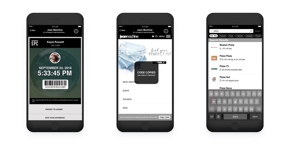
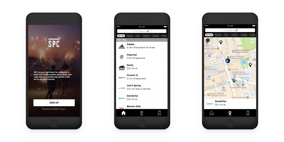
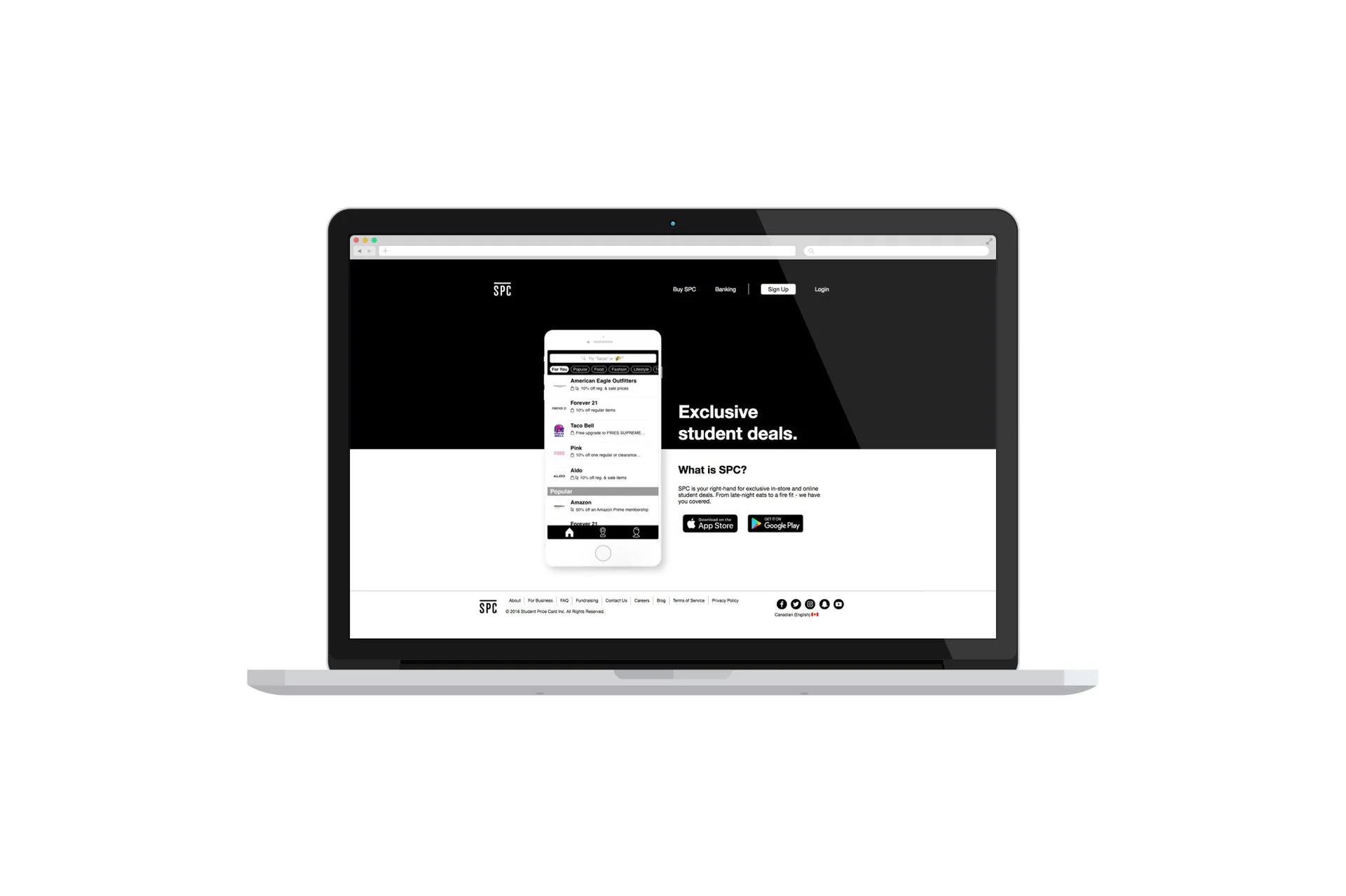
SPC’s platforms had evolved over time without a unified product strategy, resulting in inconsistent user experiences across the website and mobile app. Students also relied heavily on a physical membership card, which limited the program’s flexibility in a rapidly shifting digital environment. The redesign needed to create a consistent product experience while introducing new features that supported online-only offers and a fully digital membership card. These changes would allow students to access discounts more easily while enabling the business to expand partnerships beyond physical retail.
My Approach
Because this was my first UX project with the company, I introduced design thinking methodologies to help guide the product strategy and align the team around user needs. I began by meeting with the executive leadership team and facilitating brainstorming sessions to explore how the SPC program could evolve in a more digital-first direction. These conversations helped define the broader vision for the platform and clarified the business goals for the redesign.
To understand the competitive landscape, I reviewed other student-focused discount platforms and digital membership programs. This research helped identify where SPC could differentiate itself and where user expectations had already been shaped by competing products. I also conducted in-person research with students across multiple university campuses in the Greater Toronto Area. Speaking directly with students provided valuable insight into how they discovered discounts, how often they used the SPC program, and what they expected from the website and mobile experience.
Using these findings, I created a primary user persona and mapped the student journey to highlight opportunities for improving discovery and redemption of offers. These artifacts helped the marketing and development teams better understand who we were designing for and how the product needed to evolve. From there, I developed early wireframes and interactive prototypes to test potential solutions. I returned to university campuses to conduct in-person usability testing, observing how students interacted with the prototypes and identifying areas of confusion or friction. Each round of feedback informed further iterations until the team felt confident in the direction of the MVP.
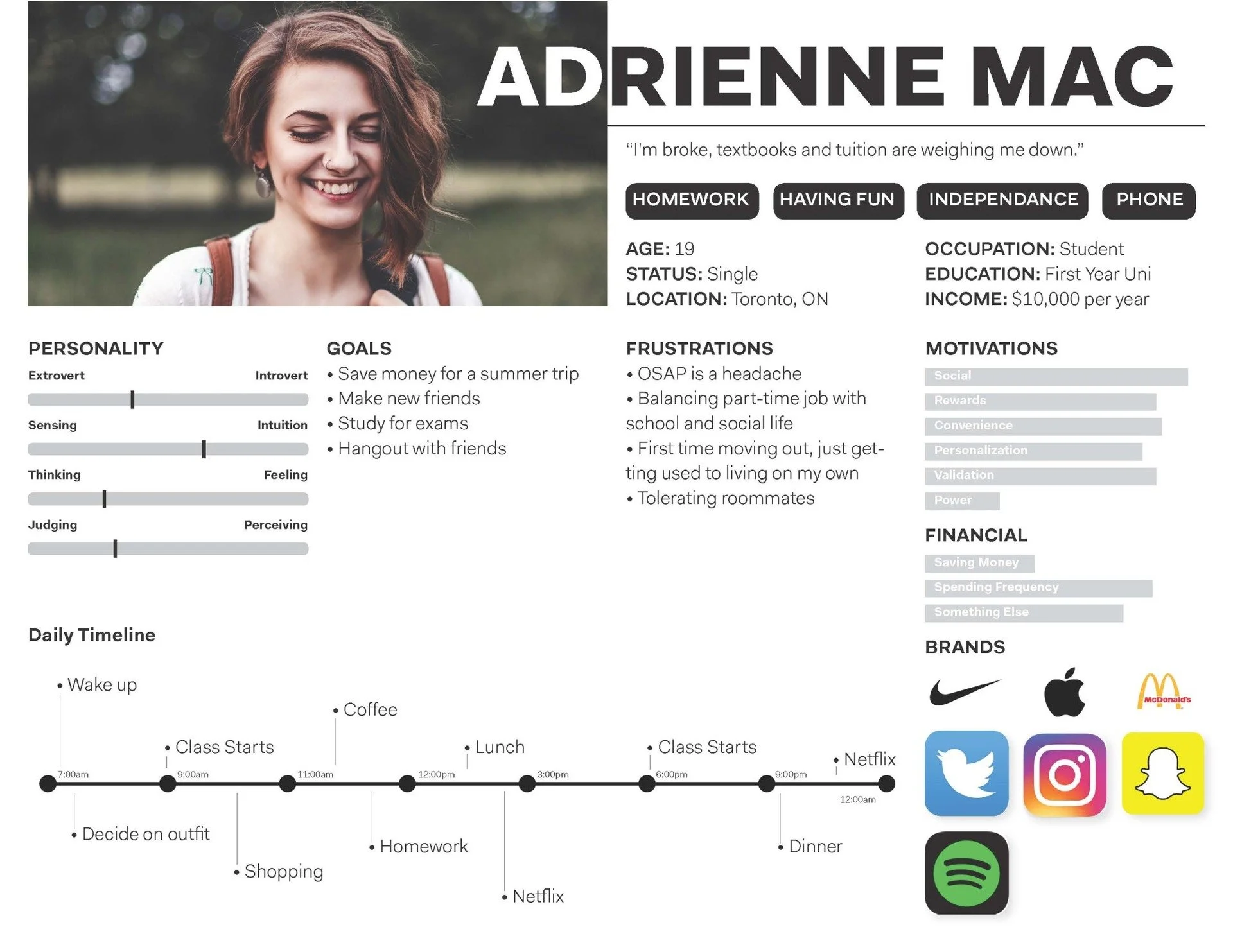
Final user persona and user journey was developed based on findings from in-person user interviews.
Bringing the Product to Life
Once the design direction was finalized, I produced detailed mockups and worked closely with developers during the implementation phase. Throughout development, I remained involved to clarify design decisions, answer product questions, and ensure the final experience reflected the intent of the design.
Outcome
The redesign established a more cohesive digital ecosystem for Student Price Card and laid the foundation for a digital-first membership experience. The new platform introduced online-only offers and a digital SPC card, allowing students to access discounts more easily across both physical and online retailers. Just as importantly, the project helped introduce user-centred design practices within the organization, demonstrating the value of research and usability testing in shaping product decisions.