OHCRN
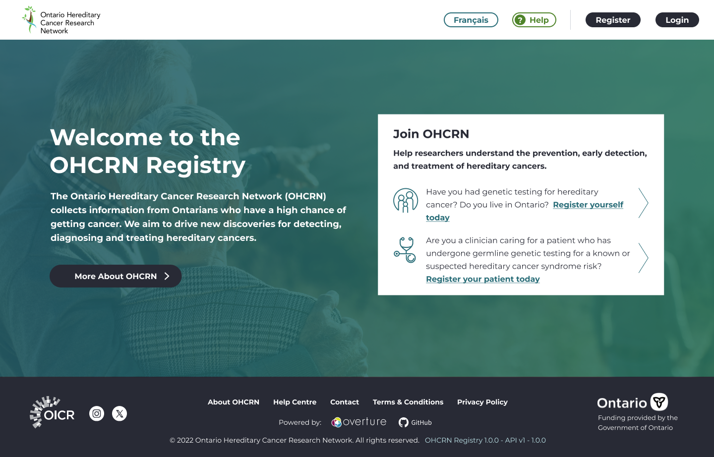
I led the UX design for a suite of three connected products supporting Ontario’s hereditary cancer registry: a Participant Portal for patients, an Admin Portal for clinic staff, and a Researcher Portal for approved researchers. Each product served a different audience with different needs, but all had to work together within strict legal and privacy constraints. I focused first on the Participant Registry, the first product scheduled to launch.
Client
Ontario Institute for Cancer Research
Years
2023 - Present
Context & Goals
This project had two defining constraints. It was the team’s first public-facing product for a non-technical audience, and the first time we prioritized responsive design. All three products also had to comply with PHIPA requirements around handling and communicating personal health information.
The goals of the project were to:
launch a suite of products for three distinct audiences
make the patient experience approachable and easy to use
streamline secure data entry for administrators enable researchers to explore large data sets without compromising privacy
I was the sole UX designer on the project and worked closely with a business analyst, engineers, clinicians, and communications and legal stakeholders. I led discovery and research, defined the user journeys and flows, designed the interfaces, and facilitated usability testing and iteration.
Problem
Most existing medical registries assume a technical or clinical user. They rely heavily on medical language, long forms that are only accessible for a desktop screen. Our audience was different. Many users had no cancer diagnosis but a genetic predisposition and were being asked to share sensitive health information and make complex consent decisions.
At the same time, PHIPA imposed strict rules around how that information could be collected and presented. The challenge was to design something that felt simple and manageable for patients while still meeting legal and institutional requirements.
Discovery & Research
I began by reviewing existing patient registries to understand common patterns and language. From this analysis, I saw recurring issues around accessibility, weak responsive behaviour, and overly clinical copy. In parallel, I worked with the business analyst to translate PHIPA and business needs into a prioritized set of requirements so we could clearly distinguish between legal obligations and optional features.
For user research, I interviewed patient advocates who volunteer with the organization and represented likely registry participants. Three themes stood out:
strong concern over privacy and data security
a desire to feel empowered in making health decisions
frustration with long or confusing administrative tasks
These insights shaped both the structure of the registration flow and the user persona.
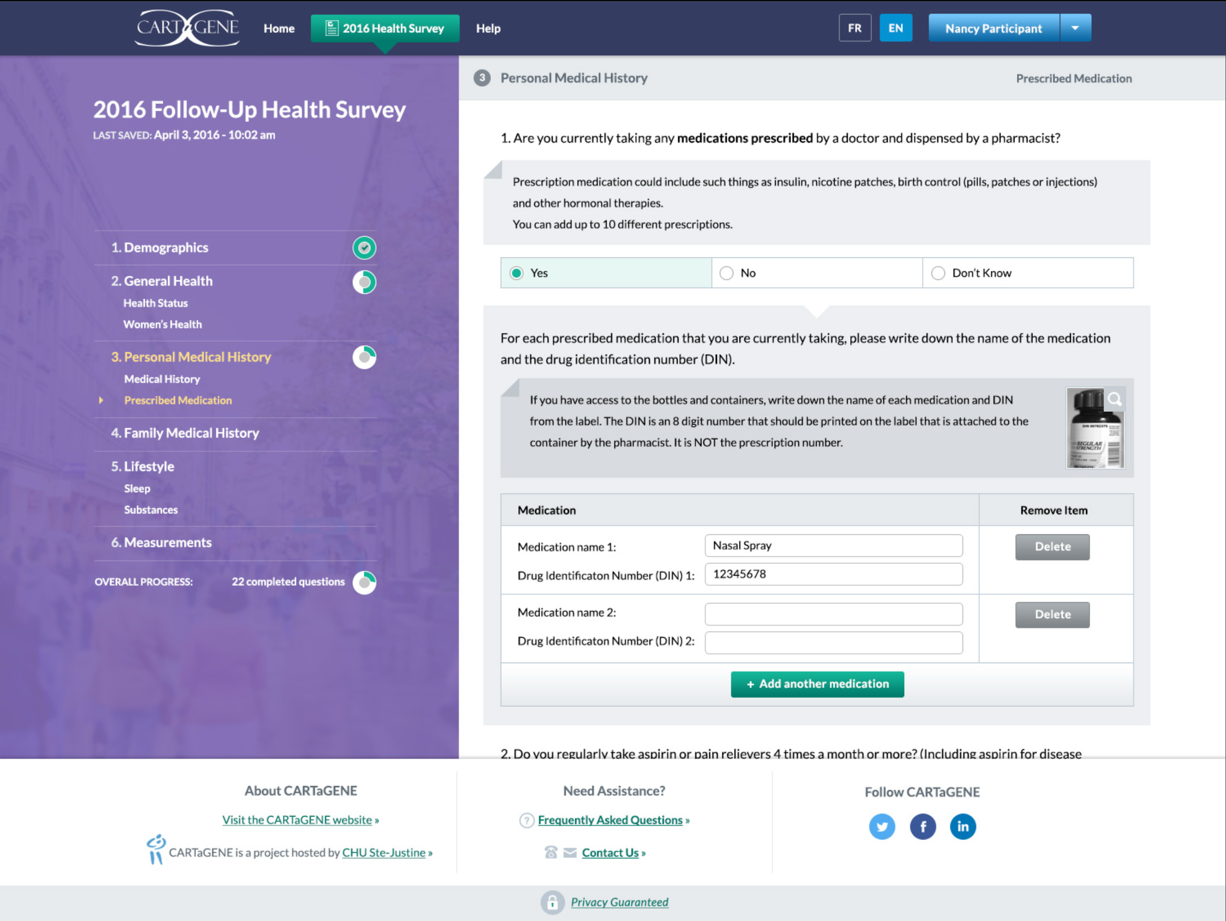
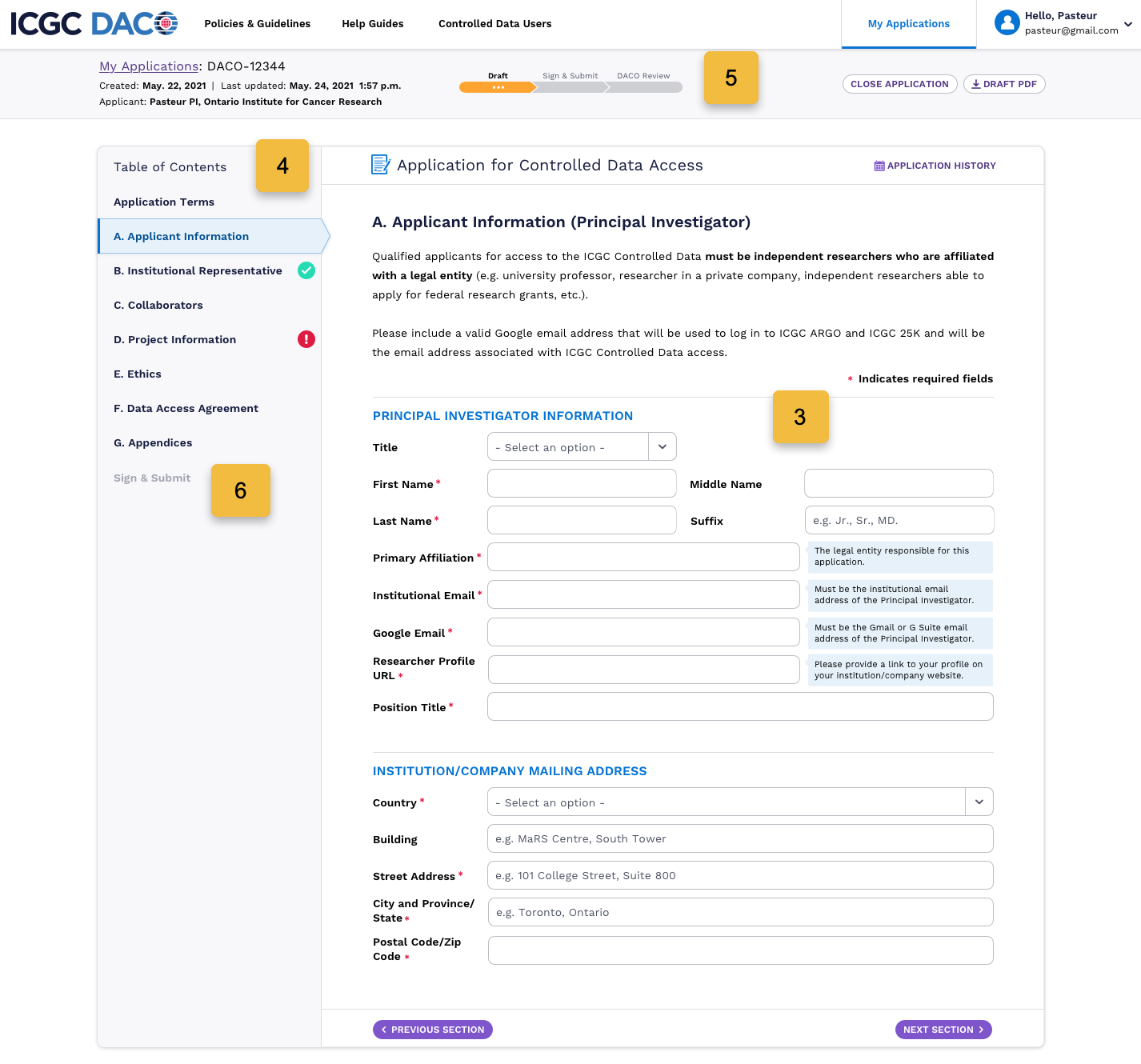
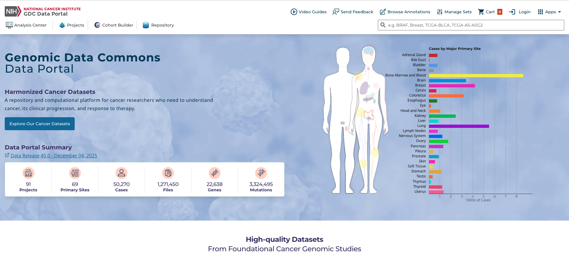
Examples of existing data portals and patient registries.
Design Approach
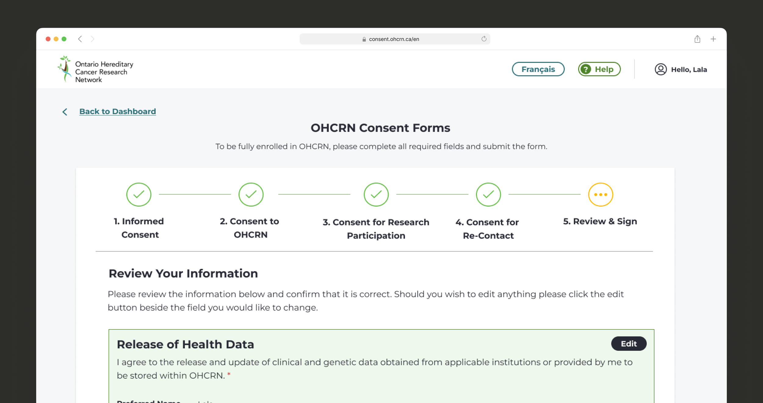
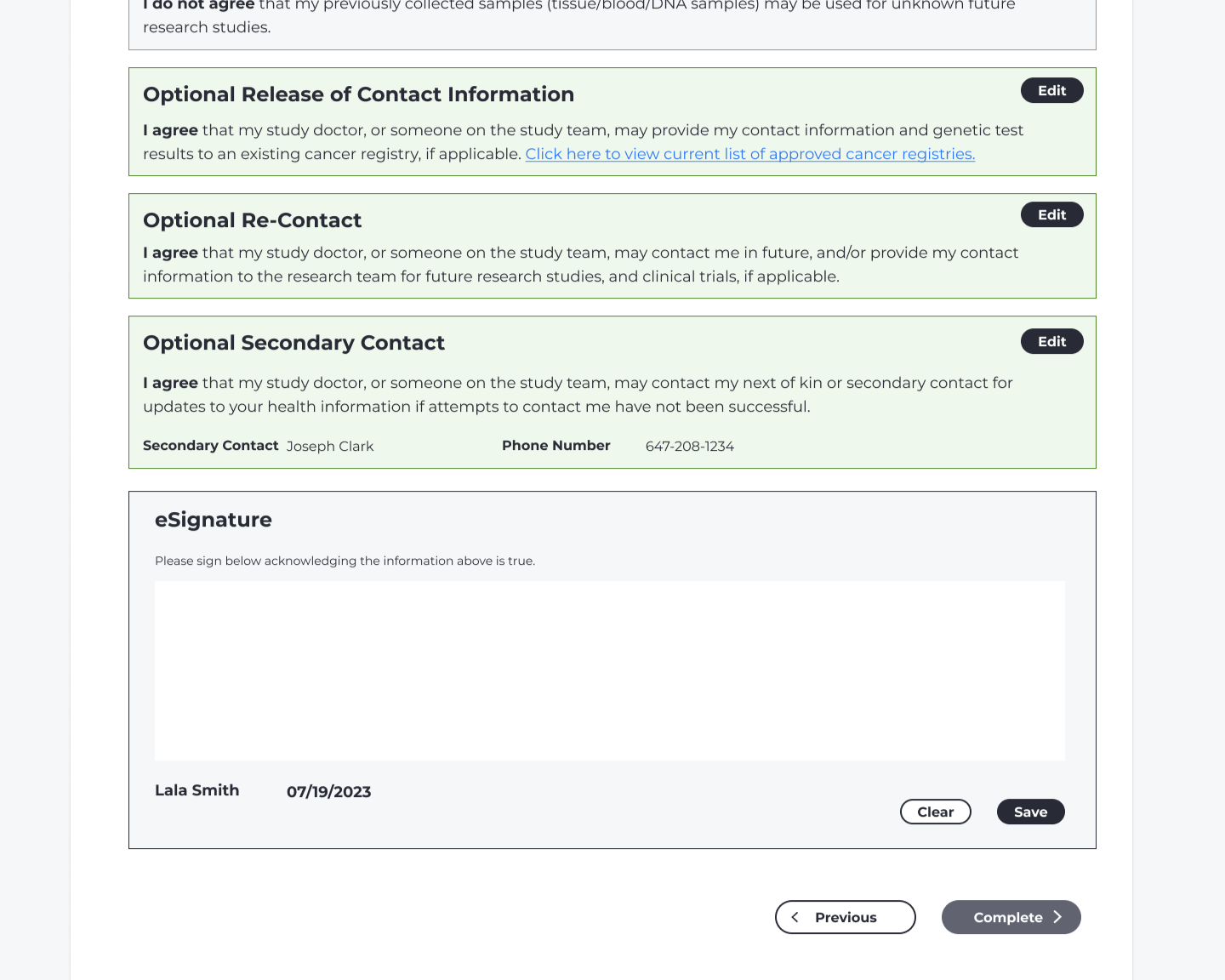
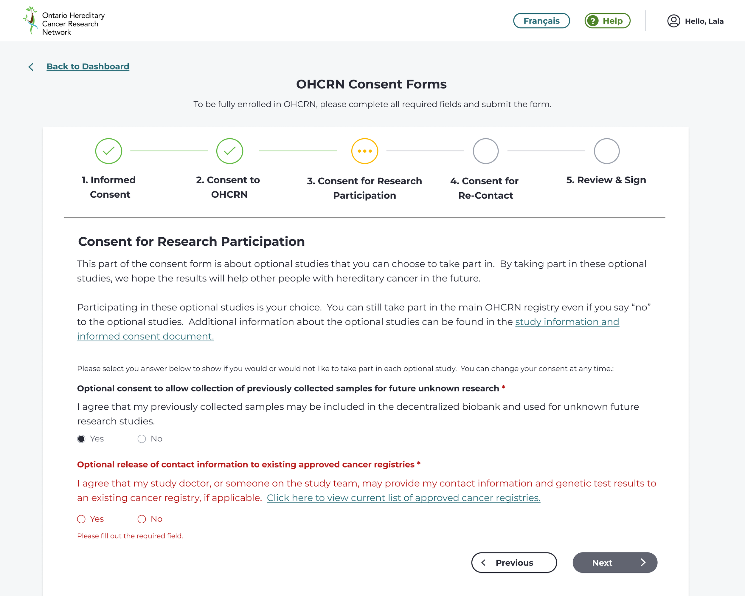
I mapped a complete journey from initial sign-up through full registration. Because the process required extensive data entry, I focused on making it feel manageable by breaking it into smaller steps, limiting the number of fields per page, and allowing users to save progress. Consent decisions were separated from personal data entry so users could focus on one type of task at a time.
Once the journey was aligned with clinicians and the business analyst, I moved into wireframes and worked with consulting doctors to include realistic draft copy. This helped us identify where language could be simplified early. Given a tight timeline, I transitioned to high-fidelity designs for testing so we could validate both usability and tone. Visually, I aimed for a design system that felt calm and trustworthy without appearing overly clinical.
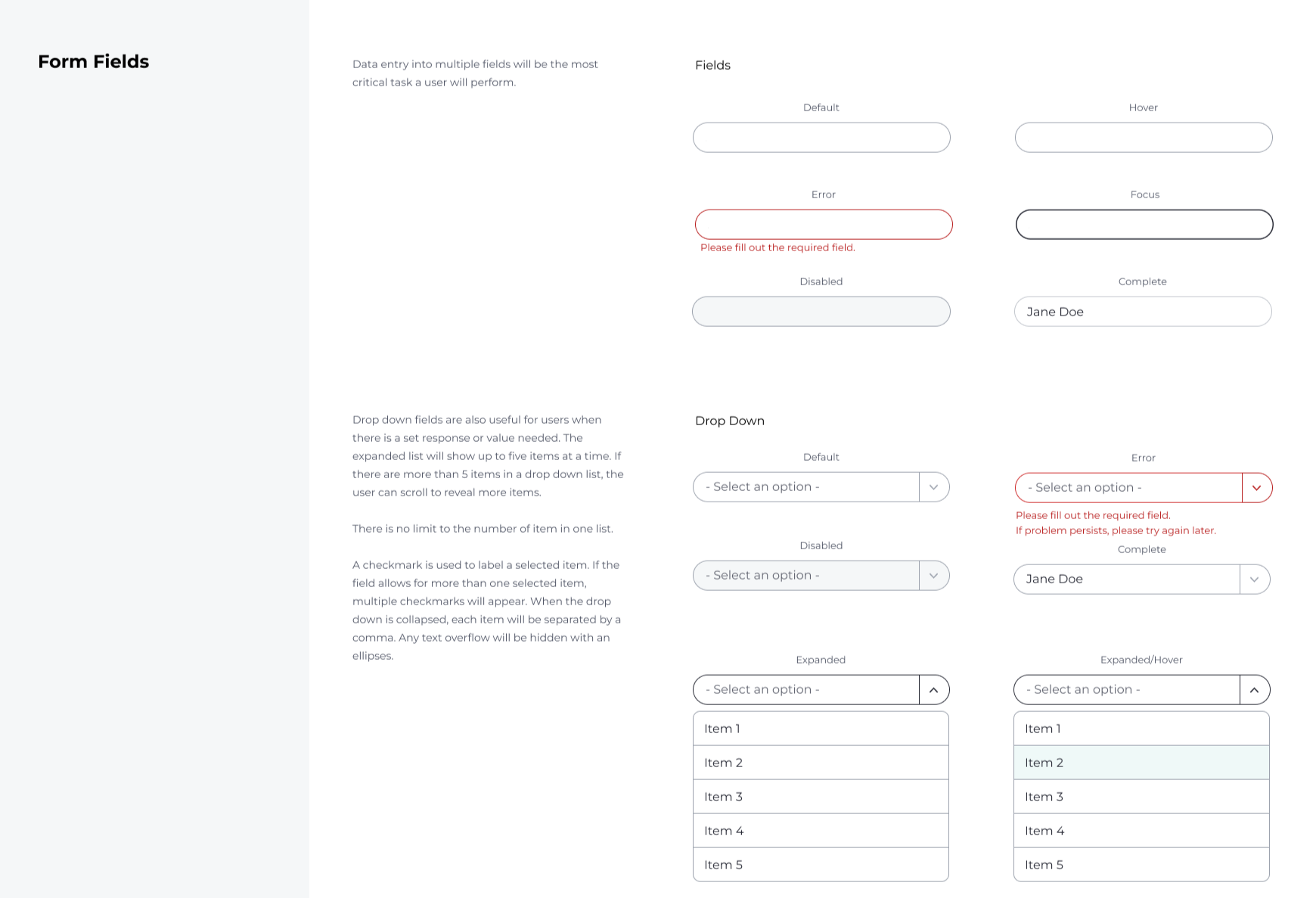
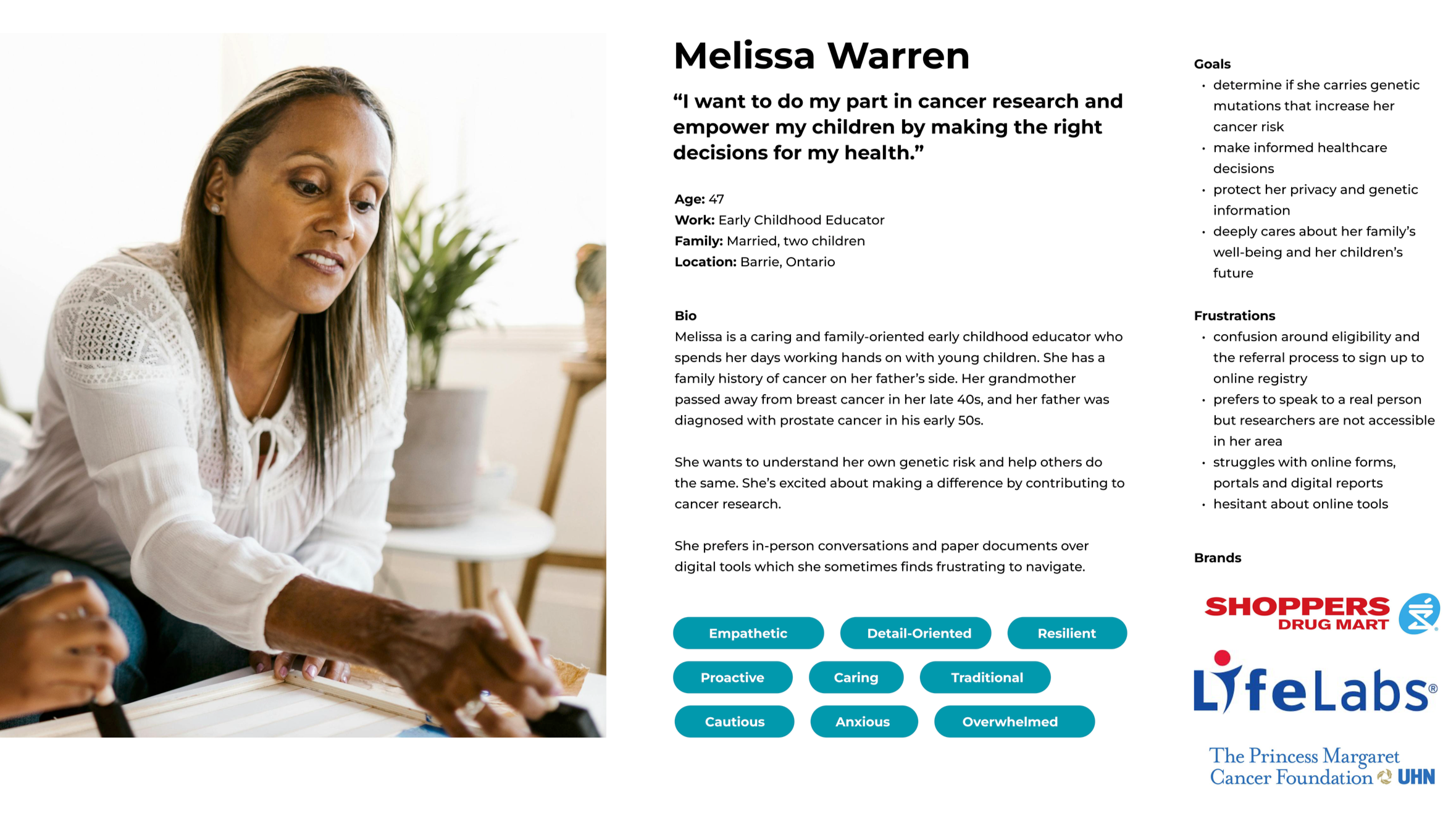
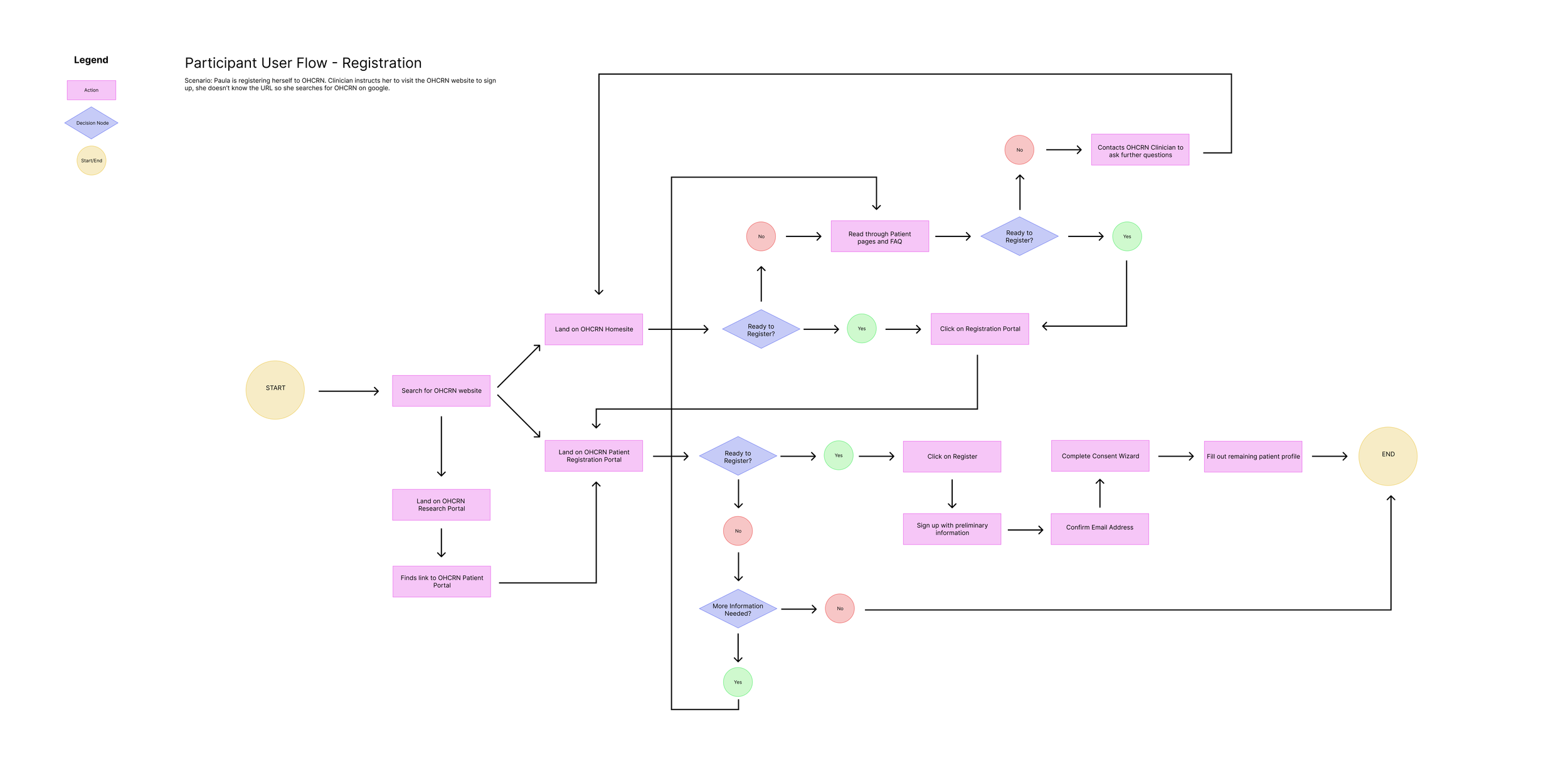
Design system developed for OHCRN. To the right, user persona and user journey for participants who are registering to OHCRN.
Usability Testing & Iteration
We conducted two rounds of usability testing with patient partners using realistic sample data. In the first round, users struggled with medical terminology and acronyms and wanted more control over reviewing and changing their consent decisions. I revised the flow to simplify language and made consent editable throughout registration.
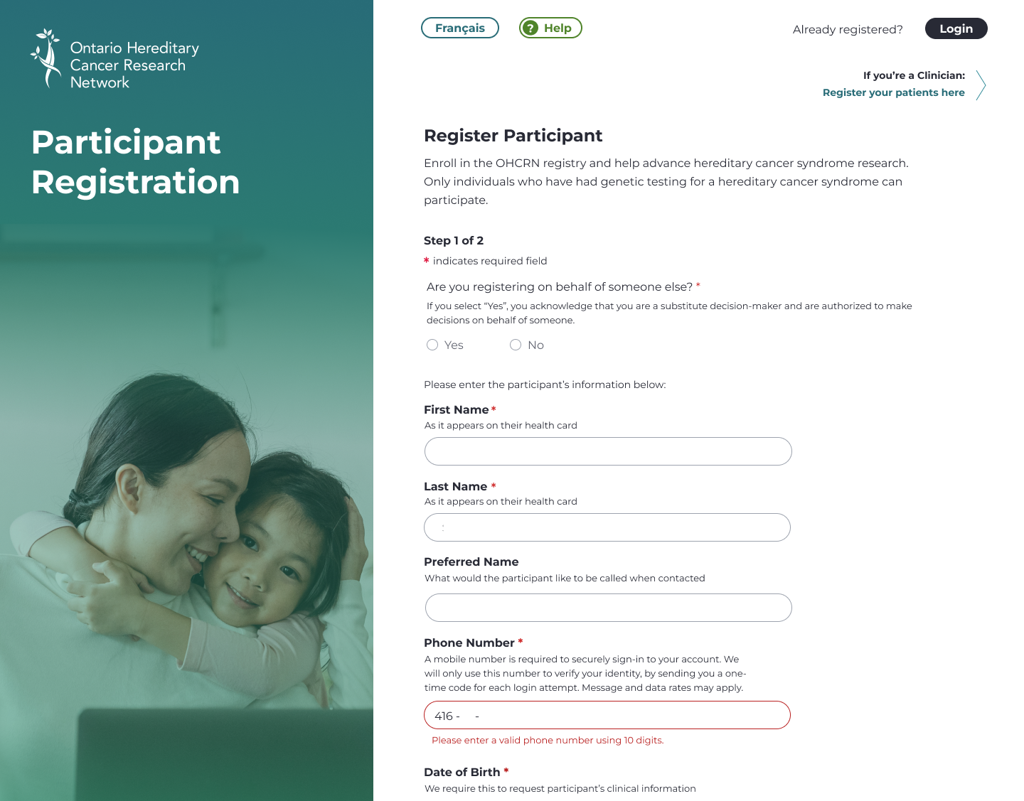
The second round revealed technical barriers. Users had difficulty meeting strict formatting requirements for fields like phone numbers, postal codes, and passwords. Originally, these fields accepted free text even though validation rules were rigid. I redesigned them with constrained input and clearer guidance to reduce user error.
We also tested with clinicians, who encountered similar issues when entering structured data. This reinforced the need for consistent input patterns across both patient and admin experiences.
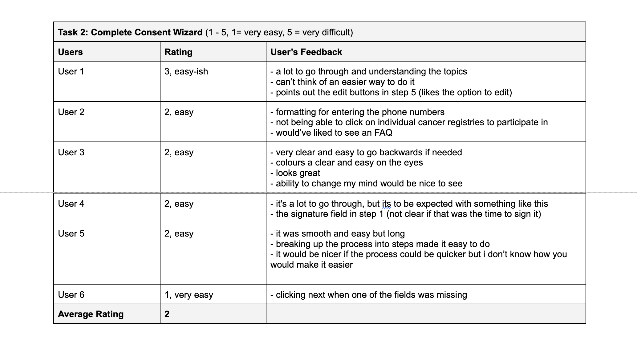
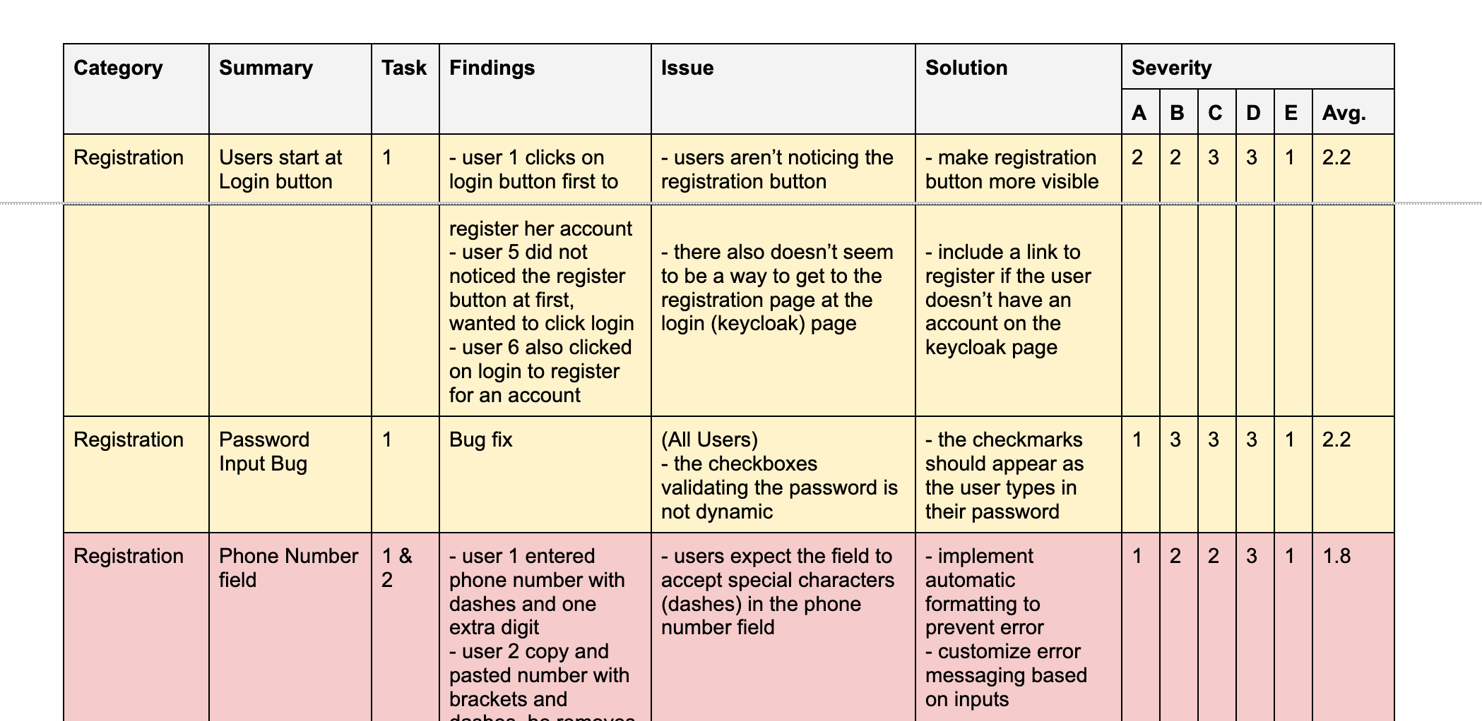
Usability testing data sorted by severity. By applying numbers to feedback you can prioritize which pain points to address that will have the most impact.
Branding Collaboration
Testing uncovered confusion around the existing logo, which paired OHCRN with a parent organization’s branding. Users found this unclear and impersonal. I worked with the communications team to create a new logo that more clearly identified OHCRN as its own product and aligned with user concerns about trust and clarity. This change came directly from research insights and influenced decisions beyond the interface itself.


Logo options for OHCRN.
Outcome
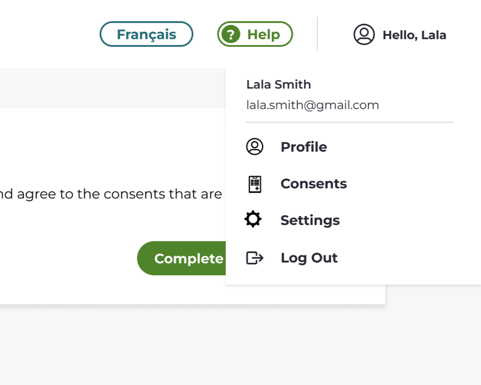
The Participant and Admin Portals launched in December 2025, and the team is continuing to onboard genetic testing clinics across the province. While usage metrics are still emerging, stakeholders were very pleased with the clarity and tone of the final product and felt it struck the right balance between accessibility and the security required under PHIPA. The Researcher Portal is currently in development and is scheduled to launch in April 2026.
Additional Products
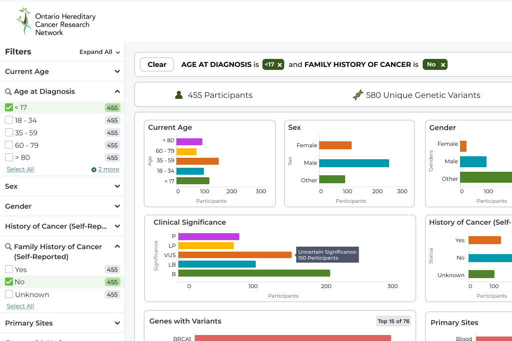
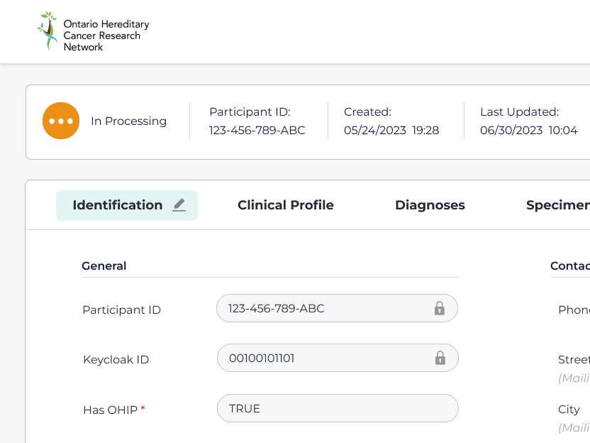
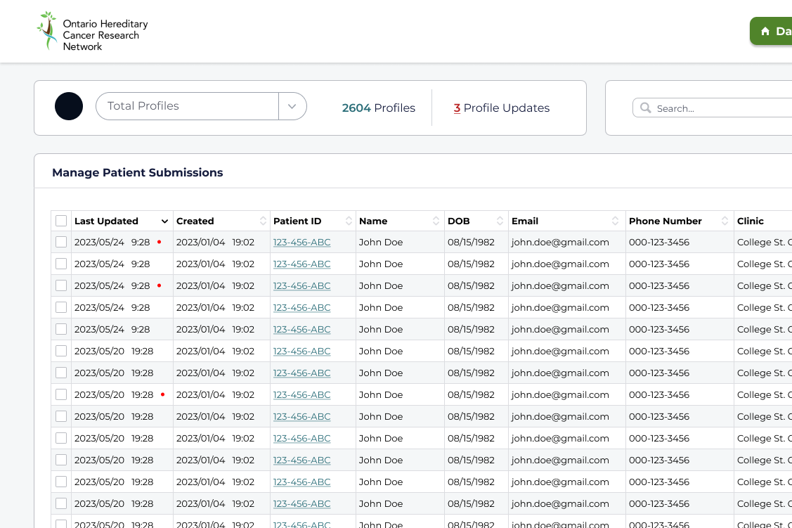
The Admin Portal was designed alongside the Participant Portal, since many workflows depended on each other. In addition to preparing user profiles for publication, administrators needed tools to support patients who were locked out of their accounts or had entered incorrect information. The main challenge was balancing efficiency with security. We explored patterns such as timed sessions, conditional field visibility, and obscuring sensitive data when not in focus.
The Researcher Portal presented a different privacy challenge: making data appealing enough to attract researchers without risking patient identification. To address this, we implemented a cell-size rule that slightly alters small data sets to preserve anonymity. I collaborated with internal scientists to determine which data sets were most meaningful to visualize.