Food Network Canada
Food Network Canada was the second lifestyle brand I led through migration at Corus Entertainment. What began as a platform move from .NET to WordPress quickly became a much larger UX transformation. With thousands of legacy recipes, a loyal 60+ audience, inconsistent ratings, and heavy reliance on search, the product needed more than a visual refresh. It required rethinking how users discover, evaluate, and follow recipes — especially on mobile.
Client
Corus Entertainment
Years
2020 - 2022
The Challenge
The business goals were clear: modernize the brand, age down the audience, and increase engagement metrics including page views, duration, and repeat visits. At the same time, we couldn’t alienate long-time viewers who were used to printing recipes and navigating the site in very specific ways.
Search was the most-used feature, yet it often failed to deliver relevant results. Recipe ratings lacked context and trust. Pages were scroll-heavy, slow to load, and not optimized for quick mobile reference — which is how many users accessed recipes in the kitchen.
My Approach
I applied a design thinking framework, prioritizing research before design. I began with analytics and competitive analysis to understand behavioural patterns. Users interacted with search more than any other feature, consumed content in short bursts, and gravitated toward recipes with strong imagery and high ratings. To align the organization, I facilitated a stakeholder survey and proto-persona workshop. From there, I conducted user interviews and usability tests with two distinct groups: new recipe cooks and loyal cable subscribers.
One insight stood out, while younger users prioritized imagery, ratings, and ingredient clarity, long-time viewers were often trying to find recipes they had just seen on TV. Many struggled with search results that were either too broad or too narrow. These findings shaped two personas and detailed user journeys that exposed friction across discovery, search, and recipe execution.
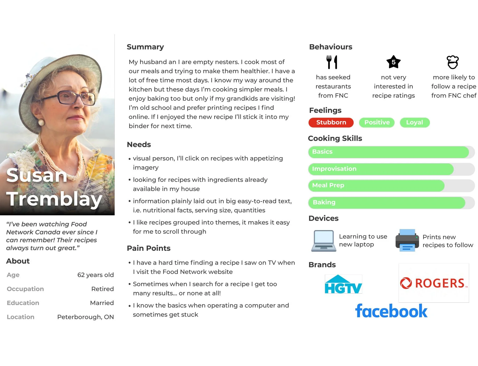
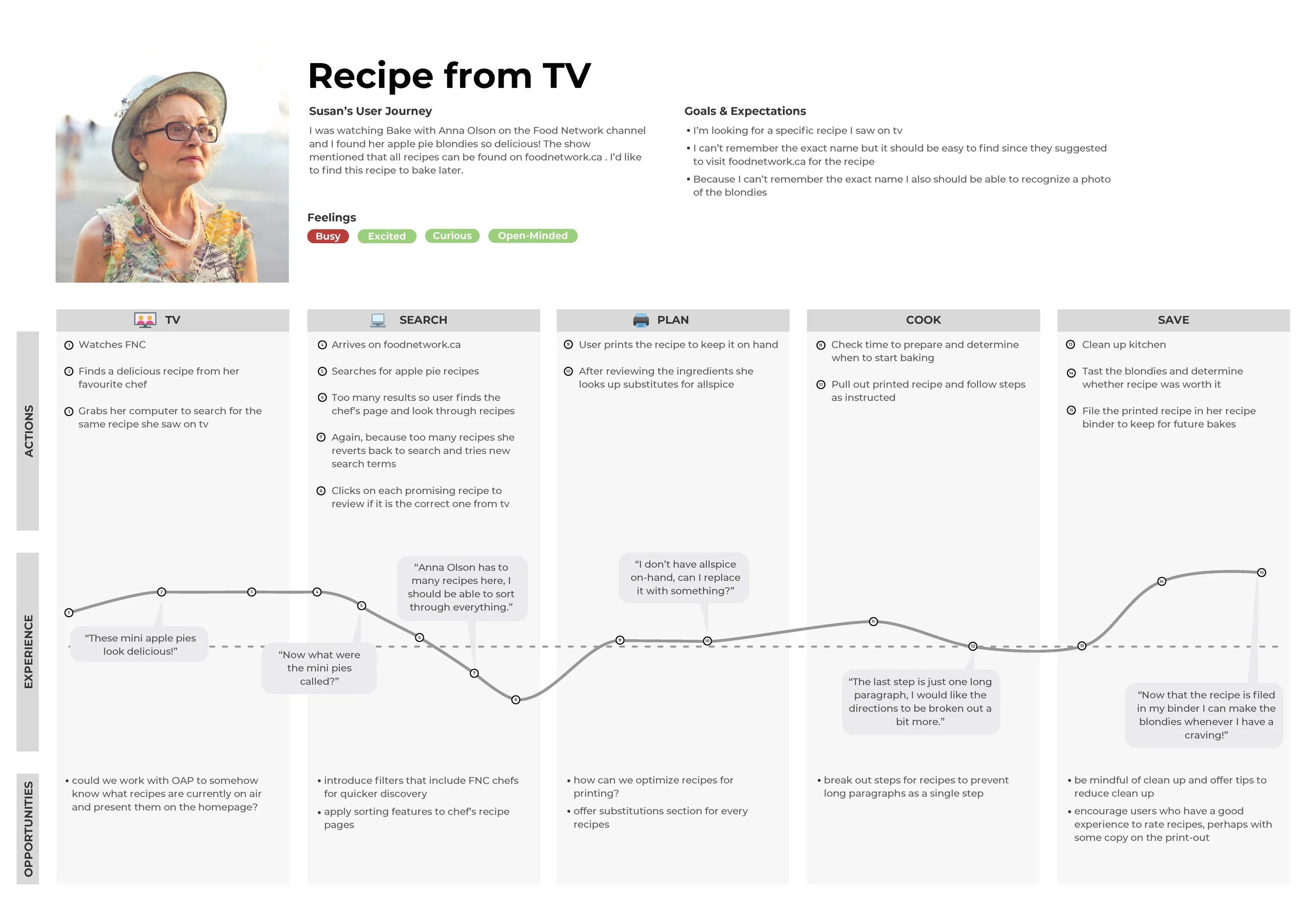
One of the user personas developed alongside the user journey for the user discovering a recipe from tv.
Designing the Experience
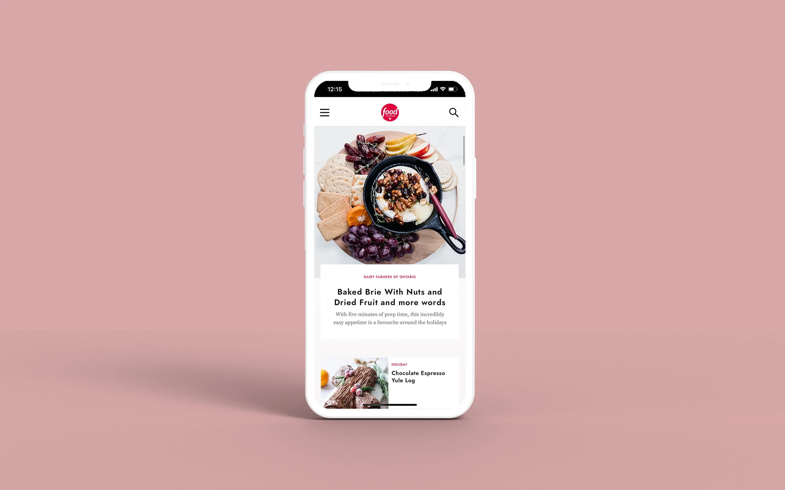
Working closely with a visual designer and cross-functional partners, I reimagined the core recipe ecosystem — homepage, search, tag pages, and the recipe page itself. We elevated key recipe information earlier in the discovery process, clarified rating context, improved sorting and filtering, and reduced scroll fatigue. All concepts were designed mobile-first. I conducted three rounds of remote usability testing using interactive Figma prototypes. After each round, I measured task success, time to completion, and perceived difficulty, then prioritized issues by severity before iterating. Testing revealed strong preferences for step-by-step photography, clearer distinctions between articles and recipes in search, and better sorting within tag pages. These refinements ensured the final product felt intuitive across demographics.
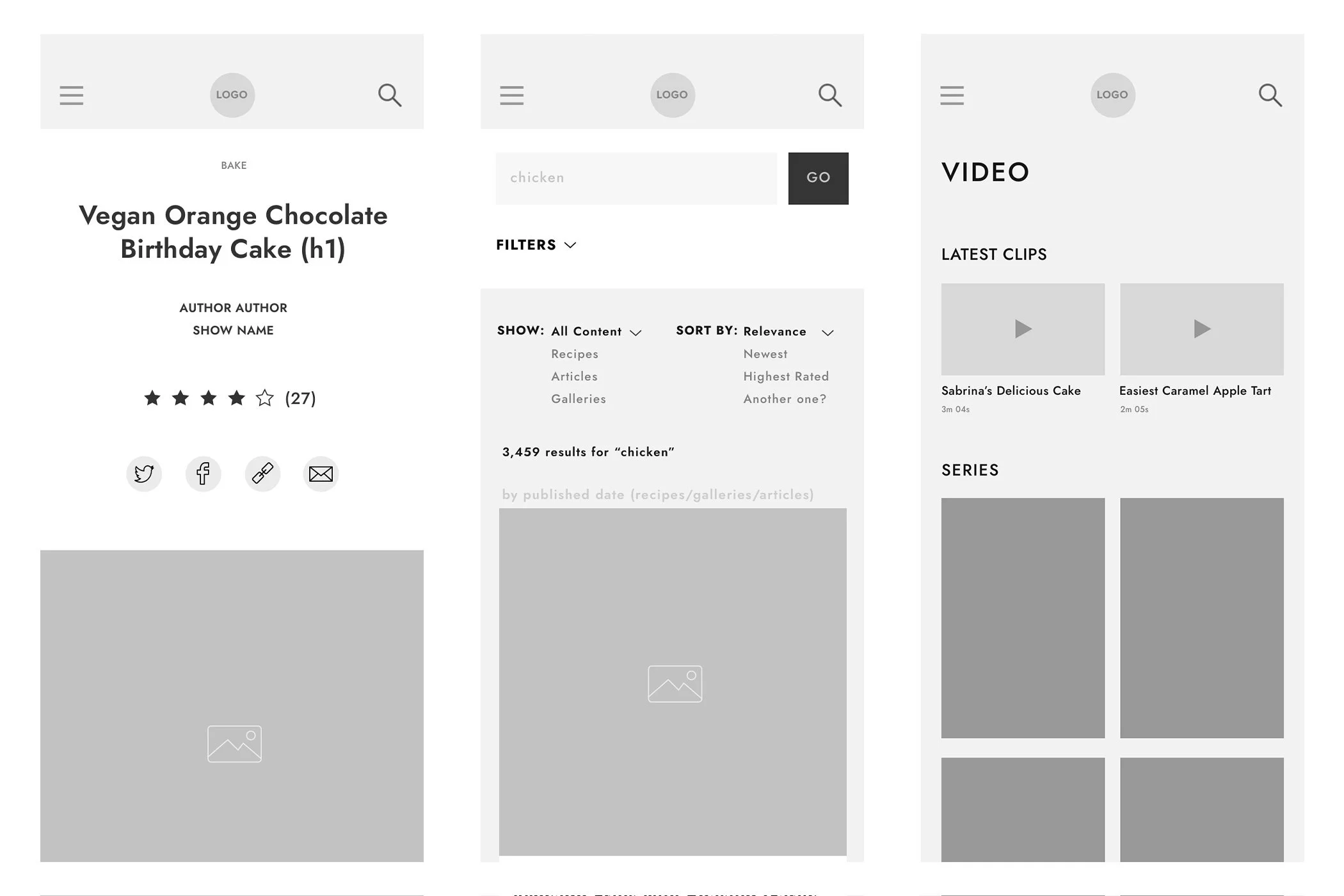
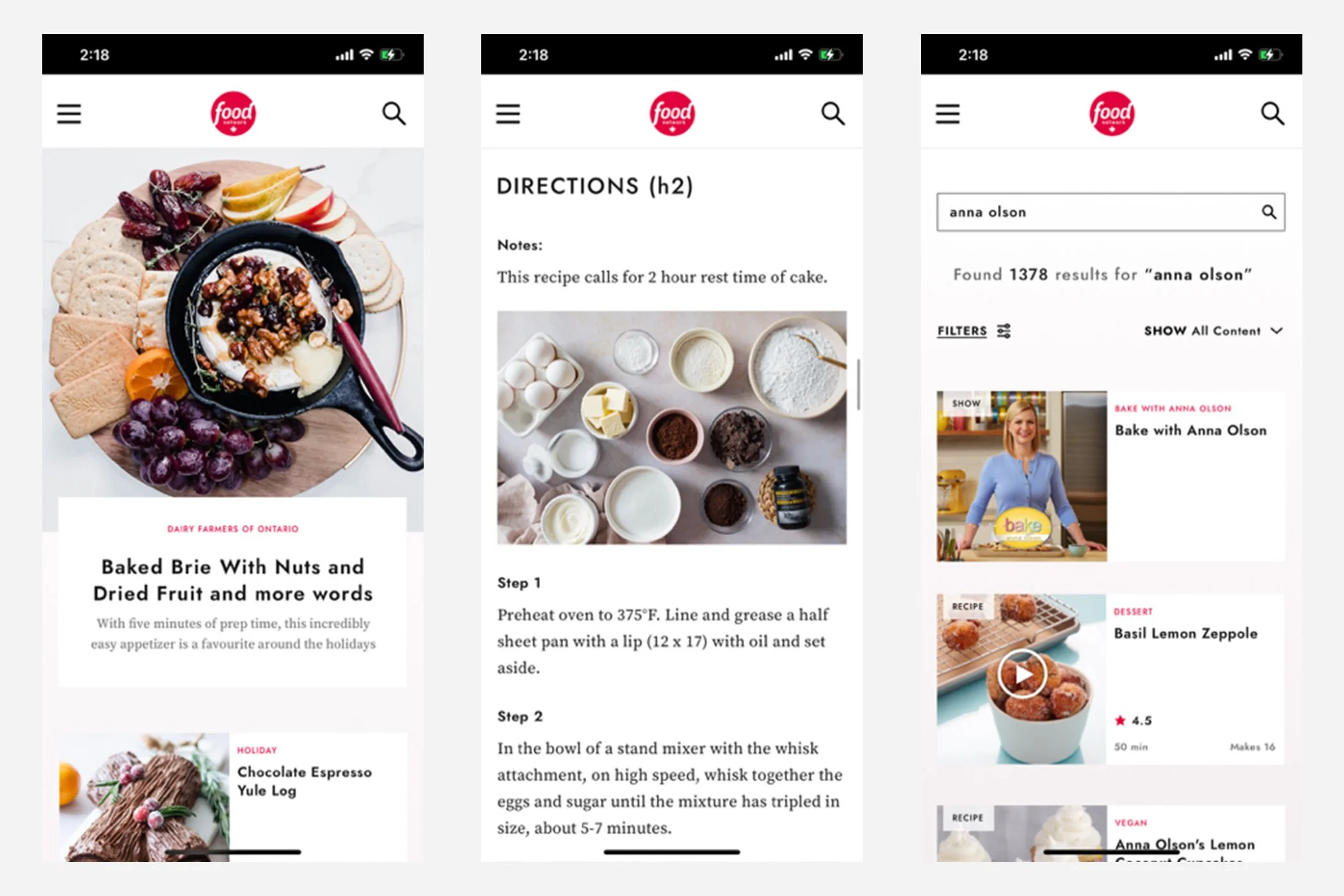
Screenshots of the design process. Progressing from wireframes to prototype to usability test results.
Treating Editors as Users
Because the platform was rebuilt in WordPress from the ground up, I also focused on backend UX. I interviewed editors, observed their publishing workflows, and identified friction in recipe creation and gallery management. We reorganized CMS fields to reflect the frontend hierarchy, rewrote labels in plain English, added helpful guidance text, improved error messaging, and introduced automation to streamline repetitive tasks. This reduced the learning curve and improved publishing efficiency.
Outcome
Food Network Canada launched in February 2022. Within three months, performance metrics began trending upward:
Average time spent on site increased 18%
Average daily visits increased 22%
Average recipe rating rose to 4.1 stars
Beyond the numbers, the redesign modernized the brand, strengthened recipe discovery, improved mobile usability, and balanced the needs of both legacy viewers and newer audiences.